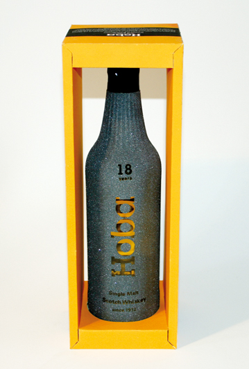
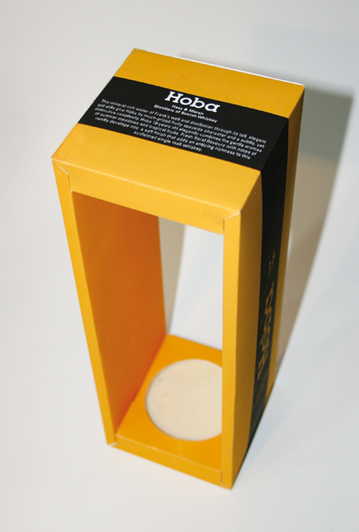
The form of the packaging is not a consistent body, from the front and back it looks like a picture frame. Thus, the product
is presented in a special position.
The packaging is coloured like gold-yellow clay. This reflects the colour of the Whiskey. A black stripe as well as the white
type-logo emphasises the noble character of the packaging.
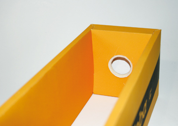
Two innovations stand for the product: first the packaging frame has no plastic foil. So one can directly take out the bottle
from the packaging and place it back in its frame. In order to do this smoothly and silently, the inside top and bottom of the
packing is furnished with a thin felt-layer.
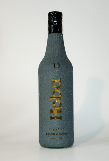
The second innovation is the surface coating of the bottle with a fine, dark-grey abrasive grit; except for the letters which
stay clean. Like this the colour of the Whisky is still visible and offers an attractive contrast to the dark-green abrasive
grit. By taking out the bottle it ensures a save grip and gives a nice feeling.